Thursday, March 26, 2009

What is a jpeg?

I get a lot of questions about the different file formats, so I figure I can go through them one at a time. I guess to start the discussion, we should really go from the basics. There are two types of art files, vector files and bitmap or raster files. Illustrator and Corel are the most popular vector art programs. Vector art is mathematical, it is geometric definitions of the designs, which allows those file to be infinitely scalable. Bitmap, or raster images are grids, and each square in the grid is defined by a color. You can easily turn any vector file into a raster file, but going back is a lot more difficult. That being said, no organization should be stuck with a jpg alone, but jpgs are great files. They can be used on the web, inserting into word files, or even into powerpoint documents. Now sometimes, you may try to insert a jpg into a word document, lets say, and you will only see a black box, or a box with a red "X". This normally means that the jpg is in the wrong color format, CMYK instead of RGB, but those are later posts. The jpegs are set restrict by the size of those blocks, known as dots per inch or DPI. The number of dots, or color blocks, per inch determine how crisp the image is. If there are only 72 dots per inch, as is the standard on the Internet, can not be used in professional printing, which has a standard of 300 dots per inch. What does that mean, please don't pull a logo off of a website and try to print it in a brochure.

Saturday, March 21, 2009

BRAND STUDY: From the Land of Beer and Cheese


Wisconsin, this week, unveiled a new tourism logo and tagline. The logo is being received in the typical way that a logo is received when the news reports on the project cost and shows the image. This branding project cost the state $50,000. Now, I can't be sure, but I feel pretty confident saying that the state got a lot more product than just the logo. Here is what my friends over at Brand New had to say about the logo: "The most common complaint is its cost, at $50,000 of tax payers’ money. The basic response is “$50,000 for that?” No, people, it’s not. $50,000 covers more than just coming up with a slogan, a typeface and an icon. But that has always been the problem of reporting costs when announcing a logo, people just assume the designers pocketed all the money. I can’t verify that the designers — in this case, Wisconsin-based Red Brown KlĂ© — didn’t pocket all the money but I am pretty positive this was not a $50,000-fee identity job.

The other main complaint was the slogan, “Live like you mean it,” which has been used by other products, campaigns and, as has been quoted in articles, even by motivational speakers and authors. Gasp, the horror: “motivational speakers and authors” have used a common phrase before Wisconsin! What a travesty. Again, people criticizing this logo need to get a grip, the problem with the tag line isn’t that it has been used before but simply that it’s generic without any specificity to Wisconsin. But so is “I Love New York”, you can love any darn state, so why does “I Love New York” only work for New York? It’s about building that message in people’s heads and if Wisconsin wants to embed the thought of living life as if you meant it, so be it, give it a chance."
Now, I am a big believer in engaging the public while creating these brand identity systems. I am Guessing that this is not really the case with this process, and seems to be the exception instead of the rule in the Tourism world, but I also believe that the greatest compliment to a brand is a parody, and within 48 hours of the brand launch, these t-shirts were available. I LOVE WISCONSIN!

Sunday, March 15, 2009

BRAND STUDY: Jack in the Box


From time to time, we will discuss things done in the corporate world. Jack in the Box has recently changed their logo, and are in the process of changing cups, wrappers, bags, and even redesigning over 2000 stores. Their ad campaigns have been focused on Jack, from his corporate jet, to his hospital bed. It seems to make sense that they move in the direction of a more personal connection with their public symbol. It was strategically designed to be a medallion, yet also be the edge of a box, and the name Jack is offset to the left so the tail of the "k" could reinforce Jack's signature smile. I am a fan, good job, Jack! What do you guys think?

Facebook Advertising is a Good Option for Local Downtowns

Facebook was talked about quite a bit at the 2009 National Main Street Conference in Chicago, Illinois. One thing that my brother Chris and I spoke about was the validity of Facebook advertising because of the cost effectiveness and the ease of targeting local customers. Even if you don't have money budgeted to advertise, you should explore the facebook audience in your area. Here is how to do it:

1. Go to Facebook
2. Click Advertising at the bottom.
3. Click the Green Button that says Create an Ad
4. On the next screen, you can type in anything, but it is a good exercise to think about what you would say with such limited characters.
5. Click continue and demographics will be added.
6. As you change demographics, the target audience size changes.

This is a great way to check out and see how good a tool facebook can be for your organization.

Friday, March 13, 2009

Using Fonts and Color to Connect

Many times, we as communities spend so much time thinking about the picture in our logo, that we forget the power of both font selection and a uniform color palette. To illustrate this, we are going to hop over to West Memphis, Arkansas. West Memphis is part of the Arkansas Delta, and in 2006 we were there and helped their Rural Heritage Development Initiative (RHDI) create a marketing identity.
We created a system there with a rich color palette of earth and river tones with an emphasis on blue because of the connection to the Blues. We also introduced a second font, Thuphap (now known as Weidower ), for the tagline- Soil & Soul.

This identity covers a 15 county region, but West Memphis is truly their front door, and serves as the gateway to the delta from tennessee travelers. When we were in West Memphis in
October of 2008, we knew that the goals that they had and the built environment there were ripe for a system that was more contemporary and progressive. I had been amazed by how much good, hard work had gone into Downtown West Memphis in the 2 years since I had been there. In fact, it looked like a different place. The ice plant was still there, but now
so was a beautiful streetscape. One of the biggest things that we had to deal with was the fact that their Main Street was not Main Street, but Broadway. We created a logo system that could work for both Main Street as an organization and Broadway as the destination. And our graphic inspiration was the Rhythm created by the banners that line this very wide Boulevard. We also introduced a tagline in WM- Wide Open, connecting the physical street with the attitude of the Main Street, volunteers, and City Planning staff. Keep your eyes open and expect great things!
Needless to say, we were thrilled when we were asked in Feb 2009 to Create an identity for a local concert series that would bridge the WM brand and the Ark Delta brand. The series is made up of four different events, so we attempted to create an umbrella identity and identities for each of the four events. Between the color palettes and the font choices, along with strategic design cues, we are really excited about the system that ties two brands together!

Friday, March 6, 2009

Powerpoint is Software, Not a Projector

This will probably be my first of many posts about Powerpoint. And this is my opinion. Powerpoint is a program designed to create and display presentations. Not create stationary. Not layout newsletters. It is a presentation software. And it is pretty good at that. That being said, powerpoint is an important tool for Main Street Programs. You should have a standardized powerpoint template for your organization to use. This template can be used by your Economic Restructuring Committee to pitch new businesses, or by Organization to present to potential donors, and we are always in favor of the Main Street Organization presenting periodic updates to City Council.
Who wants to learn how to make a customized powerpoint show?
There are really three different ways to make this happen.
1. Insert Background Image
2. Create Master page
3. Create Template File

Branding to the Experience Economy

We had an opportunity this week to speak at the 2009 National Main Streets Conference in Chicago. One of the sessions that we did was Branding to the Experience Economy. We felt like this was an important message to help local Main Street Programs to be as effective as possible. We have posted our powerpoint online here. Check it out!

Thursday, March 5, 2009

Mississippi Main Street Freshens up their Image


The Mississippi Main Street program is one of the best coordinating programs in the country, and I have had several opportunities to work with their communities to help them develop community branding campaigns. When I realized that I would have a little time at home after the baby came, I asked Bob Wilson if I could take a stab at freshening up the identity system for the program. The previous logo was well implemented, and appeared on the signs which announced arrival to all the Main Street Communities, but it did not create a system that made it easier to teach the four point approach, nor position the organization as a creative, and progressive economic development entity. The Association's recent move into a new office building marked to perfect time to freshen things up, as their printed materials were going to have to be updated anyway.So we created this progressive new logo, made up of a defined color palette, contemporary san serif font, and icon, comprised of four images, representing the Main Street Four Point Approach®. We also introduced a new program tagline: four points for progress. We felt like these fours words summed up the efforts of this statewide support network network. We created different versions of the logo, depending on where they would be used, for example, on a national level, Mississippi is larger, helping to make it stick out from other state coordinating programs. On the local level, we even created a simple version of the four blocks and MMSA, allowing local communities to roll the identity into their own marketing materials. One of the best parts about this system is its ability to promote the tenets of Main Street Revitalization approach with the four committee structure. We even created sub logos to help MMSA when training program managers and volunteers on those four points. Over the coming months, you will see this logo system begin to be incorporated in their website, stationary, and program materials, and we look forward to seeing the benefits that it has for the organization. For more information about the Mississippi Main Street program, go to http://www.msmainstreet.com
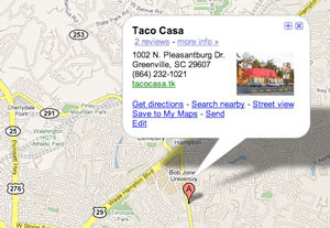
Getting Your Local Businesses on Google Maps


One of the questions I get asked the most is in reference to how to get our local businesses listed on Google Maps. Luckily, Google makes this process about as easy as most things on google.
Here are the Steps:
Step 2: Click on Add new business
Step 3: On the next page, you will input address, contact info, website, description, and even be able to fix incorrect marker location
Step 4: After Confirming the marker location, the next page will allow you to categorize your business, and specify hours, which is hugely helpful for shops and restaurants. Here, you can also add photos, and even a video of the shop owner talking about their place of business.
Step 5: Confirm the information. You can confirm the information by phone or postcards, and is all automated.
Step 6: Bask in your googleness!
I have put together a step by step video to make it easier!